12.03.15
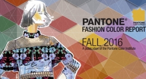
Pantone 15-3919 Serenity and Pantone 13-1520 Rose Quartz have been selected as Pantone's Color of the Year selection for 2016—“a harmonious pairing of inviting shades that embody a mindset of tranquility and inner peace,” according to the color authority.
As consumers seek mindfulness and well-being as an antidote to the stress of modern day lives, welcoming colors that psychologically fulfill the yearning for reassurance and security are becoming more prominent, said Pantonne. Weightless and airy, like the expanse of the blue sky, Serenity comforts with a calming effect, bringing feelings of respite and relaxation even in turbulent times. Rose Quartz is a persuasive yet gentle tone that conveys compassion and a sense of composure.
“With the whole greater than its individual parts, joined together Serenity and Rose Quartz demonstrate an inherent balance between a warmer embracing rose tone and the cooler tranquil blue, reflecting connection and wellness as well as a soothing sense of order and peace,” said Leatrice Eiseman, executive director of the Pantone Color Institute.
Pantone will host a webinar today (12:00pm - 12:45pm EST) about the Color of The Year pick. You can learn more about the webinar here: http://www.pantone.com/pci or sign up here.
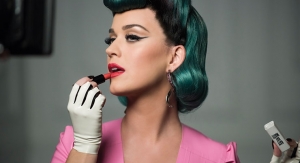
For beauty, the pairing offers a variety of lip, cheek and eye palette options, as well as hues for nail color, according to Pantone. Flattering against many skin tones, beauty looks pairing the lighthearted, healthy glow of Rose Quartz, with the cool, refreshing tone of Serenity, create a soft and natural statement. Done with a natural, light touch, the flattering pink that enhances the lip, cheek and eye, can be blended with a hint of the cool blue tone that contributes to a beautiful, neutral-based eye shadow palette, accented by classic solid nails or creative nail art that incorporates both shades in the design. Juxtapose with neons for a bold and interesting contrast. Appealing in all finishes, matte, metallic and glossy, a layer of silver sparkle creates added drama, the firm said.
The combination also challenges some more traditional perceptions around color association, according to Pantone.
“In many parts of the world we are experiencing a gender blur as it relates to fashion, which has in turn impacted color trends throughout all other areas of design,” said Eiseman. “This more unilateral approach to color is coinciding with societal movements toward gender equality and fluidity, the consumers’ increased comfort with using color as a form of expression which includes a generation that has less concern about being typecast or judged, and an open exchange of digital information that has opened our eyes to different approaches to color usage.”
As consumers seek mindfulness and well-being as an antidote to the stress of modern day lives, welcoming colors that psychologically fulfill the yearning for reassurance and security are becoming more prominent, said Pantonne. Weightless and airy, like the expanse of the blue sky, Serenity comforts with a calming effect, bringing feelings of respite and relaxation even in turbulent times. Rose Quartz is a persuasive yet gentle tone that conveys compassion and a sense of composure.
“With the whole greater than its individual parts, joined together Serenity and Rose Quartz demonstrate an inherent balance between a warmer embracing rose tone and the cooler tranquil blue, reflecting connection and wellness as well as a soothing sense of order and peace,” said Leatrice Eiseman, executive director of the Pantone Color Institute.
Pantone will host a webinar today (12:00pm - 12:45pm EST) about the Color of The Year pick. You can learn more about the webinar here: http://www.pantone.com/pci or sign up here.
For beauty, the pairing offers a variety of lip, cheek and eye palette options, as well as hues for nail color, according to Pantone. Flattering against many skin tones, beauty looks pairing the lighthearted, healthy glow of Rose Quartz, with the cool, refreshing tone of Serenity, create a soft and natural statement. Done with a natural, light touch, the flattering pink that enhances the lip, cheek and eye, can be blended with a hint of the cool blue tone that contributes to a beautiful, neutral-based eye shadow palette, accented by classic solid nails or creative nail art that incorporates both shades in the design. Juxtapose with neons for a bold and interesting contrast. Appealing in all finishes, matte, metallic and glossy, a layer of silver sparkle creates added drama, the firm said.
The combination also challenges some more traditional perceptions around color association, according to Pantone.
“In many parts of the world we are experiencing a gender blur as it relates to fashion, which has in turn impacted color trends throughout all other areas of design,” said Eiseman. “This more unilateral approach to color is coinciding with societal movements toward gender equality and fluidity, the consumers’ increased comfort with using color as a form of expression which includes a generation that has less concern about being typecast or judged, and an open exchange of digital information that has opened our eyes to different approaches to color usage.”