02.11.16
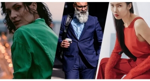
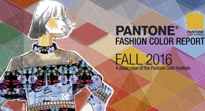
Global color authority Pantone LLC debuted its Fall 2016 Color Report. This semi-annual style guide, released in the fall and spring, showcases the top 10 hues for women’s and men’s fashion.
Launching alongside New York Fashion Week, the Pantone Fashion Color Report Fall 2016 takes a comprehensive look at fashion designers’ use of color in their upcoming collections, offering a color snapshot for the season ahead. The full report is available at Pantone.com/Fall-2016.
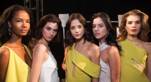
For Fall 2016, designers were inspired by fine art – particularly abstract art, landscapes and graphic geometrics – yielding a 10-color palette that is led by the Blue family, conveying a message of calm and constancy. Along with anchoring earth tones, exuberant pops of vibrant colors also appear throughout, representing this season’s take on graphical elements and geometric shapes across the collections. Some designers are using clean lines and shapes against more fluid, abstract patterns for fall, while others have done the reverse. Both of these trends can be likened to the unexpectedly vivacious colors in the Fall 2016 palette, which act as playful but structured departures from the more typical fall shades.
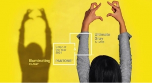
“If you look at this season’s entire palette, the idea of comforting Blues coming to the top of the list again shows that people are still searching for that reassurance,” said Leatrice Eiseman, executive director of the Pantone Color Institute. “The color Blue is fundamentally important to the human eye as a stable icon of the balance in our universe. Even in an uncertain world where cultural, economical and social tensions can cause us anxiety, we remember that the Blue skies represent constancy – they have never fallen. The Grays give a feeling of stability and represent rock solid colors that you can go back to and use with everything in your wardrobe. The Red tones invite confidence and warmth while the hot Pinkish Purples and Spicy Mustard Yellows suggest a touch of the exotic, rounding out a palette that is stable and grounded but also bold and complex.”
The unilateral approach to color and trend toward gender neutrality also continues. Enthusiastically responding to a public that is more comfortable with color as expression and less concerned with stereotypical ideas about gender, we see a breadth of color choices that transcend sexual identity, preference or bias in both the men’s and women’s collections this season.
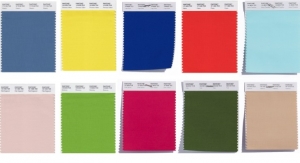
The top colors for women’s and men’s fashion for Fall 2016 are:
· Pantone 174028 Riverside
· Pantone 144122 Airy Blue
· Pantone 173914 Sharkskin
· Pantone 18-1550 Aurora Red
· Pantone 16-1318 Warm Taupe
· Pantone 18-1630 Dusty Cedar
· Pantone 18-5845 Lush Meadow
· Pantone 14-0952 Spicy Mustard
· Pantone 18-1340 Potter’s Clay
· Pantone 17-3240 Bodacious
Launching alongside New York Fashion Week, the Pantone Fashion Color Report Fall 2016 takes a comprehensive look at fashion designers’ use of color in their upcoming collections, offering a color snapshot for the season ahead. The full report is available at Pantone.com/Fall-2016.
For Fall 2016, designers were inspired by fine art – particularly abstract art, landscapes and graphic geometrics – yielding a 10-color palette that is led by the Blue family, conveying a message of calm and constancy. Along with anchoring earth tones, exuberant pops of vibrant colors also appear throughout, representing this season’s take on graphical elements and geometric shapes across the collections. Some designers are using clean lines and shapes against more fluid, abstract patterns for fall, while others have done the reverse. Both of these trends can be likened to the unexpectedly vivacious colors in the Fall 2016 palette, which act as playful but structured departures from the more typical fall shades.
“If you look at this season’s entire palette, the idea of comforting Blues coming to the top of the list again shows that people are still searching for that reassurance,” said Leatrice Eiseman, executive director of the Pantone Color Institute. “The color Blue is fundamentally important to the human eye as a stable icon of the balance in our universe. Even in an uncertain world where cultural, economical and social tensions can cause us anxiety, we remember that the Blue skies represent constancy – they have never fallen. The Grays give a feeling of stability and represent rock solid colors that you can go back to and use with everything in your wardrobe. The Red tones invite confidence and warmth while the hot Pinkish Purples and Spicy Mustard Yellows suggest a touch of the exotic, rounding out a palette that is stable and grounded but also bold and complex.”
The unilateral approach to color and trend toward gender neutrality also continues. Enthusiastically responding to a public that is more comfortable with color as expression and less concerned with stereotypical ideas about gender, we see a breadth of color choices that transcend sexual identity, preference or bias in both the men’s and women’s collections this season.
The top colors for women’s and men’s fashion for Fall 2016 are:
· Pantone 174028 Riverside
· Pantone 144122 Airy Blue
· Pantone 173914 Sharkskin
· Pantone 18-1550 Aurora Red
· Pantone 16-1318 Warm Taupe
· Pantone 18-1630 Dusty Cedar
· Pantone 18-5845 Lush Meadow
· Pantone 14-0952 Spicy Mustard
· Pantone 18-1340 Potter’s Clay
· Pantone 17-3240 Bodacious