10.24.22
Inolex has a new logo and positioning, but it remains a fiercely independent company that creates sustainable ingredients for health, beauty and wellness. Inolex unveiled its new visual identity at press conference earlier this week.
“We don’t swim with the current; we create it,” explained Lisa Gandolfi, PhD, vice president-marketing, Inolex. “We envision and realize solutions to advance the needs of our customers. We challenge ourselves and the industry to think differently.”
According to Gandolfi, in honoring nature, Inolex designs emerging technologies that ensure the safe and optimum performance of leading brands in more than 85 countries.

Lisa Gandolfi, PhD, VP-marketing, Inolex
“Our designers are guided by the Principles of Green Chemistry, to invent the future of sustainable ingredient platforms,” she said. “By balancing conscious science with nature and artistry, our imaginative approaches become the building blocks for exceptional products that care for people and our planet.”
The Inolex team, Gandolfi added, challenges itself and the industry to think differently. The new logo and positioning reflect those commitments. Inolex worked with Pentagram, an international design consultant that was recently named the most influential design firm of the past 50 years.
Pentagram concurrently developed a distinct compact logo of a singular X. The X is a distilled visual representation of the primary logo. It stands as a symbol rich in meaning and as a memorable visual that confidently celebrates the last letter of the Inolex name.
“Our name has a strong identity. The Pentagram team called it a gift that our name ends in an X,” recalled Gandolfi. “They leaned into it. X stands for the multiplication of many things. It represents the unknown and a special something. The X Factor. It is an interesting letter to grasp onto—especially from the science aspect.”
The X logo underscores the concepts of health, beauty and wellness, all backed by strong science.
“We are ingredient designers—not just suppliers,” explained Gandolfi. “And we portray ourselves as an industry disruptor.”
To underscore the artistry and disruption that is Inolex, Gandolfi recalled how the company was inspired by the work of Anna Atktins (1799-1871)—an English botanist, illustrator and photographer. Her 1843 work, “Photographs of British Algae, Cyanotype Impressions,” is believed to be the first published book illustrated with photographic images.
The Inolex color palette expresses the company’s mission and attributes around sustainability, creativity, and approachability. The Inolex teal was chosen specially for the company as a brilliant and modern expression of its ethos. Inolex teal resides at the perfect confluence between water blue and earth green.
“There was a need for deep change in how we express Inolex,” said Gandolfi.
The Inolex teal reflects water blue and earth green.
The company’s primary color palette is accompanied by a broader palette inspired by Inolex’s consciously sourced sustainable raw materials and further represented through its core product lines. The new typeface defines Inolex as a company of bold and responsible ingredient designers and conveys the company’s rebellious spirit, according to Gandolfi.
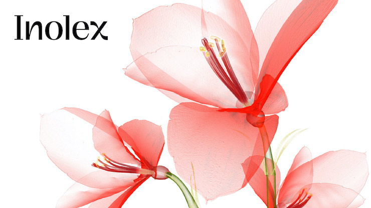
In addition to the unique, hand-drawn logo, Inolex has a complete system of proprietary imagery has been developed to portray the duality of science and nature with dynamic compositions that evoke curiosity and create a feeling of freshness and calm breathing space.
Throughout the presentation, Gandolfi pointed out that Inolex thrives due to its strong business network.
“We equip and encourage enduring partnerships that are devoted to serving one another,” she explained. “We extend ourselves, care deeply and do great things we couldn’t achieve alone.”
She described that partnership as a community of individuals deeply devoted to thoughtful design, authenticity and beauty.
The imagery may be new, but Inolex has a rich history of innovation. For example, Spectrastat G2 Natural MB is a 100% Natural Broad Spectrum Preservation System that is plant-based, NaTrue approved and 100% biobased. ProCondition 22 is a natural-derived, sustainable quat alternative. Green chemistry designed, Inolex calls the brassica-derived cationic conditioner a replacement for BTAC, CTAC or SAPDMA. AminoSensyl HC is a 100% natural quat-free hair conditioning system that is COSMOS-approved. LexFeel N350 MB is a dimethicone alternative that is 100% natural, vegan and readily biodegradable, according to Inolex.
These innovations are reflected in the new Inolex logo and imagery, concluded Gandolfi.
“We are fresh, distinctive and proudly fit within beauty and personal care.”
“We don’t swim with the current; we create it,” explained Lisa Gandolfi, PhD, vice president-marketing, Inolex. “We envision and realize solutions to advance the needs of our customers. We challenge ourselves and the industry to think differently.”
According to Gandolfi, in honoring nature, Inolex designs emerging technologies that ensure the safe and optimum performance of leading brands in more than 85 countries.
Lisa Gandolfi, PhD, VP-marketing, Inolex
The Inolex team, Gandolfi added, challenges itself and the industry to think differently. The new logo and positioning reflect those commitments. Inolex worked with Pentagram, an international design consultant that was recently named the most influential design firm of the past 50 years.
Pentagram concurrently developed a distinct compact logo of a singular X. The X is a distilled visual representation of the primary logo. It stands as a symbol rich in meaning and as a memorable visual that confidently celebrates the last letter of the Inolex name.
“Our name has a strong identity. The Pentagram team called it a gift that our name ends in an X,” recalled Gandolfi. “They leaned into it. X stands for the multiplication of many things. It represents the unknown and a special something. The X Factor. It is an interesting letter to grasp onto—especially from the science aspect.”
The X logo underscores the concepts of health, beauty and wellness, all backed by strong science.
“We are ingredient designers—not just suppliers,” explained Gandolfi. “And we portray ourselves as an industry disruptor.”
To underscore the artistry and disruption that is Inolex, Gandolfi recalled how the company was inspired by the work of Anna Atktins (1799-1871)—an English botanist, illustrator and photographer. Her 1843 work, “Photographs of British Algae, Cyanotype Impressions,” is believed to be the first published book illustrated with photographic images.
The Inolex color palette expresses the company’s mission and attributes around sustainability, creativity, and approachability. The Inolex teal was chosen specially for the company as a brilliant and modern expression of its ethos. Inolex teal resides at the perfect confluence between water blue and earth green.
“There was a need for deep change in how we express Inolex,” said Gandolfi.
The Inolex teal reflects water blue and earth green.
The company’s primary color palette is accompanied by a broader palette inspired by Inolex’s consciously sourced sustainable raw materials and further represented through its core product lines. The new typeface defines Inolex as a company of bold and responsible ingredient designers and conveys the company’s rebellious spirit, according to Gandolfi.
In addition to the unique, hand-drawn logo, Inolex has a complete system of proprietary imagery has been developed to portray the duality of science and nature with dynamic compositions that evoke curiosity and create a feeling of freshness and calm breathing space.
A Grateful Business Partner
Throughout the presentation, Gandolfi pointed out that Inolex thrives due to its strong business network.
“We equip and encourage enduring partnerships that are devoted to serving one another,” she explained. “We extend ourselves, care deeply and do great things we couldn’t achieve alone.”
She described that partnership as a community of individuals deeply devoted to thoughtful design, authenticity and beauty.
The imagery may be new, but Inolex has a rich history of innovation. For example, Spectrastat G2 Natural MB is a 100% Natural Broad Spectrum Preservation System that is plant-based, NaTrue approved and 100% biobased. ProCondition 22 is a natural-derived, sustainable quat alternative. Green chemistry designed, Inolex calls the brassica-derived cationic conditioner a replacement for BTAC, CTAC or SAPDMA. AminoSensyl HC is a 100% natural quat-free hair conditioning system that is COSMOS-approved. LexFeel N350 MB is a dimethicone alternative that is 100% natural, vegan and readily biodegradable, according to Inolex.
These innovations are reflected in the new Inolex logo and imagery, concluded Gandolfi.
“We are fresh, distinctive and proudly fit within beauty and personal care.”
