Christine Esposito, Managing Editor09.04.23
The primary role of packaging is to keep a product contained, of course. But in today’s beauty and personal care space, bottle, tubes and packs are more than vessels that house products. They are multi-taskers that showcase the brand’s image and deliver important information about ingredients, all with less impact on the environment than ever before.
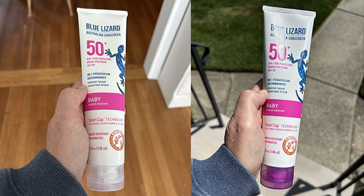
The best packaging designs can do even more. Happi checked in with Nicole Watson, executive director of marketing at Crown Laboratories, to get details about how this fast-rising skin health company is engaging consumers through smart design, like Blue Lizard sunscreen’s color-shifting sun care bottle, to sustainability.
HAPPI: Talk to us about the evolving role of packaging in the personal care category. What is different now than it was in years past.
Watson: Consumers are very well informed, and they expect a lot from the personal care brands they choose. Their demand for eco-responsible packaging has really pushed retailers and brands to work together with shared sustainability goals. It’s very exciting to see so many attractive, innovative and eco-conscious packaging options available now. This is the result of consumers driving all of us to up our game—it’s highly achievable to create packaging that’s both chic, functional, budget friendly and representative of our consumers’ values.
HAPPI: How is Crown Laboratories using packaging design in personal care to engage consumers?
Watson: Crown Therapeutics is refreshing nearly every brand in the portfolio during the next year or so. We are engaging with consumers on our packaging and design refreshes, making sure the changes we implement will ultimately be helpful to the end user and provide them with an even better customer experience. Across all of our long-trusted brands, from Blue Lizard Australian Sunscreen to PanOxyl, to Sarna, consumers all share a desire for simplified communications on packaging. Packaging must work very hard at the shelf to stand out and to help the consumer make the right selection with ease. We’re excited to introduce new designs that more clearly communicate what the consumer needs to know, while also taking the opportunity to improve packaging sustainability and to make useful modifications— improving pump mechanics for example, while offering designs that look modern and fresh.
HAPPI: Can you share more about Blue Lizard Sunscreen-changing packaging—the germ of the idea and how it was executed?
Watson: The color changing packaging is a popular packaging feature with both dermatologists and consumers. Parents especially love it because it gets their kids interested in sunscreen and makes it more fun for the little ones. Dermatologists love it because it reminds people they are exposed to UV rays and need to reapply their sunscreen. The idea for the color changing packaging was born from our CEO, Jeff Bedard, and his business partner at the time. The desire was to make consumers aware of their passive UVA exposure—like cloudy days, or reflective UVA like when someone sits in the shade or drives a car. They moved forward with a patent on the package that indicated any time UVA was present. Many people may not know, the Australian Blue Tongue Lizard that is native to Australia changes color to protect itself from the harsh elements of the Australian Outback. So, the color changing UVA indicator bottle was inspired by this native Australian reptile—thus, Blue Lizard Australian Sunscreen with Smart Bottle Technology was born.
HAPPI: Are there other examples of impactful packaging design or redesign underway at the company?
Watson: Our product commercialization team is excited to bring recycled content into the bottles for Desenex and Zeasorb. Desenex had a very challenging color target—it’s known for its distinct bright yellow. It sounds simple enough to just move to PCR, but it takes a lot of time and persistence to get recycled content to perfectly match brand colors. There was a ton of energy and commitment put into this project to get the brand where it needs to be and to also move this legacy brand into sustainable packaging with improvements to the overall functionality and look.
