Happi Staff12.05.19
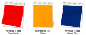
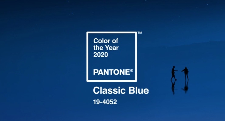
A timeless and enduring blue hue, the Pantone Color of the Year for 2020—Pantone 19-4052 Classic Blue—is elegant in its simplicity. Suggestive of the sky at dusk, the reassuring qualities of the thought-provoking blue highlight our desire for a dependable and stable foundation on which to build as we cross the threshold into a new era, said the company.
“We are living in a time that requires trust and faith. It is this kind of constancy and confidence that is expressed by Pantone 19-4052 Classic Blue, a solid and dependable blue hue we can always rely on….a boundless blue evocative of the vast and infinite evening sky,” said Leatrice Eiseman, executive director of the Pantone Color Institute, Carlstadt, NJ.
For over 20 years, Pantone’s Color of the Year has influenced product development and purchasing decisions in multiple industries, including fashion, home furnishings, and industrial design, as well as product packaging and graphic design.
The Pantone Color of the Year selection process requires thoughtful consideration and trend analysis. To arrive at the selection each year, Pantone’s color experts at the Pantone Color Institute comb the world looking for new color influences. This can include the entertainment industry and films in production, traveling art collections and new artists, fashion, all areas of design, popular travel destinations, as well as new lifestyles, playstyles, and socio-economic conditions.
Influences may also stem from new technologies, materials, textures, and effects that impact color, relevant social media platforms and even upcoming sporting events that capture worldwide attention.